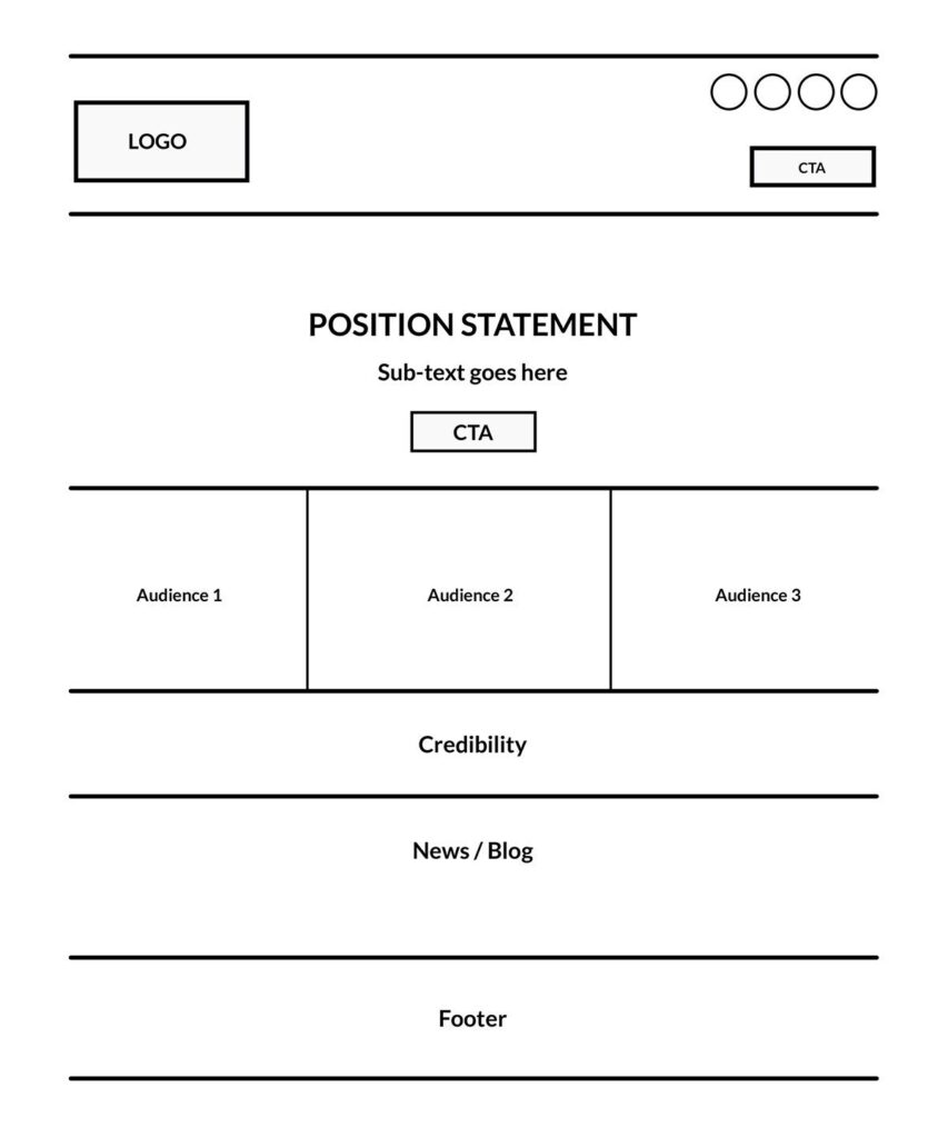
I’ve seen a few articles surface recently about the web being boring. Admittedly, as passionately as Workhorse Marketing is about designing and developing websites, we sometimes feel this is a legitimate question, stemming from the fact that so many websites these days have a similar structure. For example, I just produced this wire in about 60 seconds flat (see image).

As you can see, it has a structure commonly found used by websites. And of course, you see a lot of striking templates available for purchase, offering you a refined version of this structure.
But, to answer the question of this article, let me ask you another question; Is your car boring? It has 4 wheels like most all other cars. Is your house boring? It has a front door like all other houses. The answer is simple – no, your house is not boring because it has a front door and your car is not boring because it has 4 wheels. Those are fundamental utilitarian structures that help a user experience the core purpose of each item in an efficient manner, helping you place focus on “what’s on the inside” while more efficiently using the tool to accomplish your goal.
While a website browsing experience has become quite standard (ie. “boring”), most businesses benefit from a standardized browsing experience. Unless your core offering is more on the entertainment experience side of things, you probably should use this structure. But just because you have a sticky nav, a big hero and a CTA (call to action) button, doesn’t mean your website is effective in communicating your brand values properly, presenting an effective content hierarchy, building credibility and most importantly, leading your user to take action.
Here’s a list of 10 mission critical elements you should consider when building a successful website.
- Header – while sticky headers are nice, make sure it’s not too thick, which can sometimes restrict the viewable content area creating a frustrating experience.
- Navigation Hierarchy – don’t throw all options in the main navigation. Rather, focus your main navigation on a core set of items fundamental to your target audience needs. Users expect pages like “About” or “Contact”, which can be placed in a secondary location that may take a split second to find.
- Credibility Building – what information on your homepage helps build credibility for your brand? Information such as testimonials, clients served, years in business and awards can help turn a visit into a lead.
- Conversion – Calls to Action, Exit Marketing, Entrance Marketing.
Devise a plan to help convert visits into leads. If you do nothing, expect your visit-to-lead conversions to be less than optimal. - Audience Segmentation & Relevancy – Provide options for your audience segments to self-identify as soon as possible. This allows your website to cater and experience and content to their needs, instead of remaining general.
- Photography – determine an optimal photography approach and when at all possible, use real photography that captures the true essence of your product or service.
- Content Hierarchy – your website is having a conversation with each visitor. Think of their entry point as if they’re walking into “your store”. What questions would they ask or how would you guide them if they were sitting directly in front of you. Translate this content hierarchy to your website.
- Responsive/Adaptive Format – all websites should work well on desktop, mobile and tablet devices. Pay specific attention to the mobile experience, with an understanding of your users needs in that environment. For example, your phone number and directions may be more important on a mobile device than desktop, so make sure they are well represented.
- Social Media Representation – we typically advise a minimal amount of social exposure on a website with the idea that a visitor has landed on your website to primarily experience and understand your product or service. They understand you have social channels and activity, and will gladly locate and click on a social icon in the footer, when they are ready for that experience. While social is extremely important to your brand (we have an entire Social Media Management department!), understand it’s proper place and exposure in your website.
- Creative Development – we like to look at how pages transition, how buttons hover, how call to action requests are positioned and how a page scrolls. In our world, this is creative development. Focus any creative development inclusion toward helping a user accomplish a more productive experience as opposed to an environment of glitz and glam. Adding a creative development style helps the other critical elements shine.
When all of these bases are covered, your website isn’t boring. Rather, it screams the passion, values and clarity of your brand from the rooftops. It engages users into a digital conversation that’s logical and meaningful to their needs.
We often tell our marketing agency clients there are no silver bullets. Rather, marketing success comes from properly executing a wide range of activities. The same goes for website design and development. A fancy template or a big hero and sticky header are not silver bullets. Dig in and cover all of your bases to achieve a highly successful website.
Workhorse Marketing is an Austin, Texas based marketing agency helping businesses acquire and retain customers by providing affordable programs that merge people, marketing strategy, technology and design.

